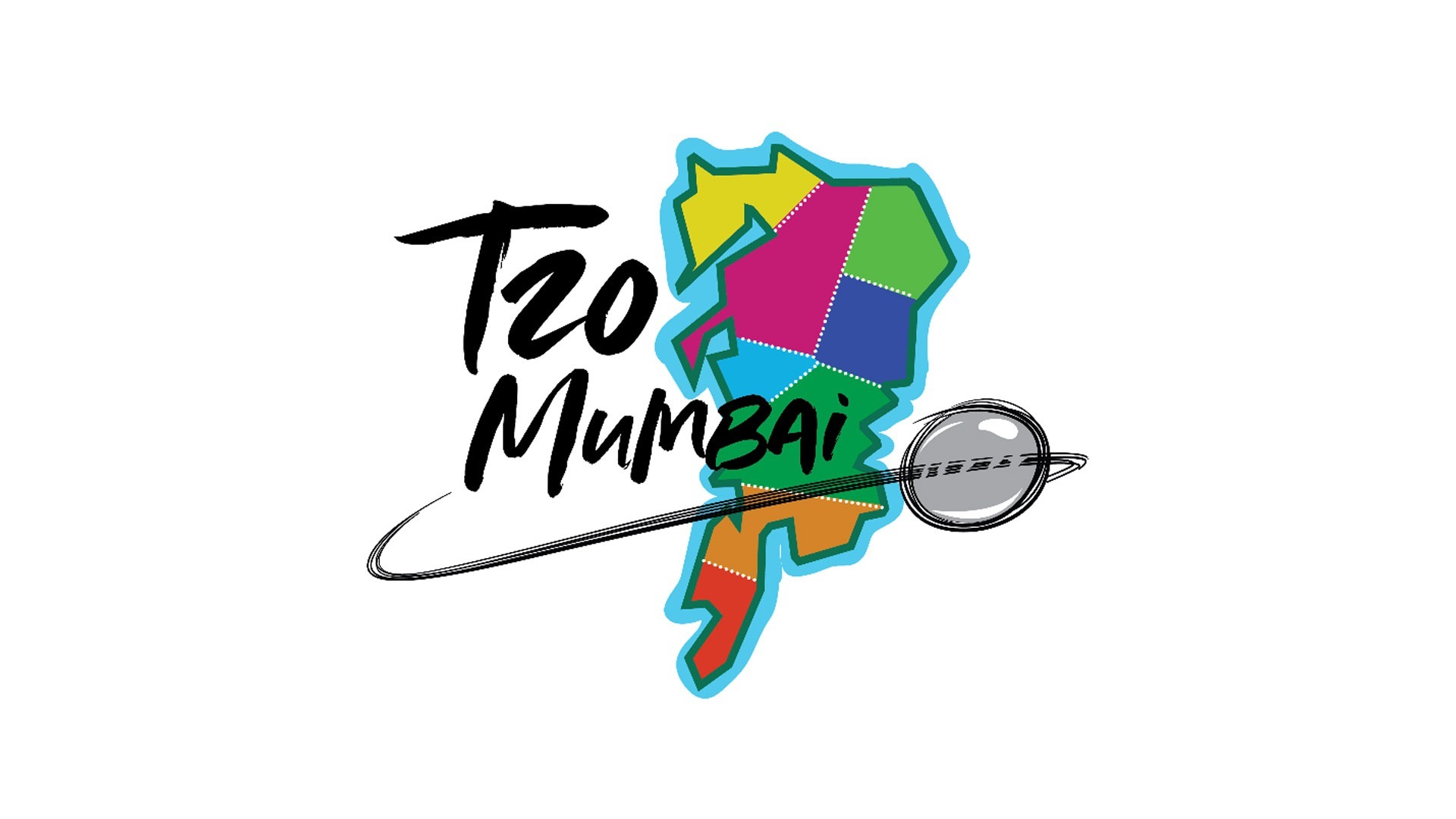
With a new design, T20 Mumbai aims to capture the vivacious spirit and vibrant nature of the city.
ttmum
Following the success of its inaugural campaign, Mumbai's premier T20 cricket competition, T20 Mumbai, has had a makeover that encapsulates the essence of the city.

To capture that essence, the league has adopted a new logo to embody the spirit of Mumbai and to represent the liveliness and energy of the city. It has done this with by representing a colour pallette as bright as the city itself featuring an animated representation of the map of Mumbai with various zones split, signifying the constituencies of the city, stitched together by a common thread of passion for cricket.
It speaks volumes of the spirit coming alive when different parts of the city come together as one to make it the cricket capital of India.
"The new logo of T20 Mumbai is vibrant, like the city itself," said Kadar Makani, CEO & MD of Probability Sports. "It's lively, impactful and something that catches your attention, and is synonymous not only with Mumbai but also with T20 cricket.
"It was important for the league to capture the essence of the city as well as the sport and the new logo does just that. It is Ekdum Mumbai"
T20 Mumbai has undergone a change! Presenting to you our new identity ahead of a new season!#CricketChaRaja pic.twitter.com/qh2ZNfMRQv
— T20 Mumbai (@T20Mumbai) 19 March 2019
Hundreds of MCA-affiliated cricketers will take part in T20 Mumbai Season 2 in what is an opportunity for youngsters to showcase their talents with and against some of the best cricketers to have emerged from the city.


